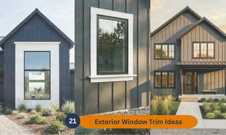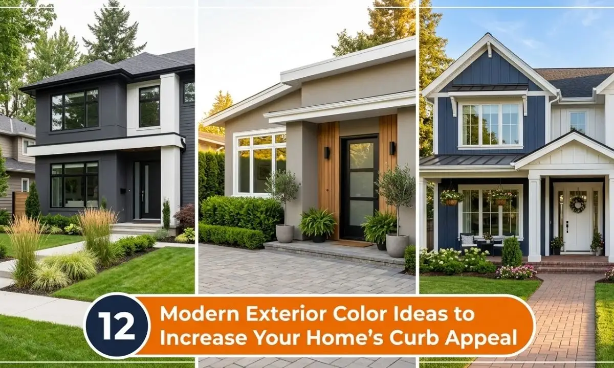
21 Modern Exterior Color Ideas to Increase Your Home’s Curb Appeal
Introduction
Your home’s exterior is the first thing the world sees and the right color can change everything. The best exterior color schemes for curb appeal do more than look beautiful. They tell a story, create emotion, and make your home impossible to ignore.
Choosing an exterior color feels overwhelming for most homeowners. With thousands of options available, it is hard to know where to start. I’ve noticed that most people do not struggle with finding colors they like, they struggle with finding combinations that actually work together in a real home.
That is exactly what this article solves. Inside you will find 21 modern, tested, and visually stunning exterior color ideas from bold and dramatic to soft and timeless. Whether you are planning a full repaint or simply dreaming and saving ideas for later, every combination here is designed to inspire real decisions and real transformations.
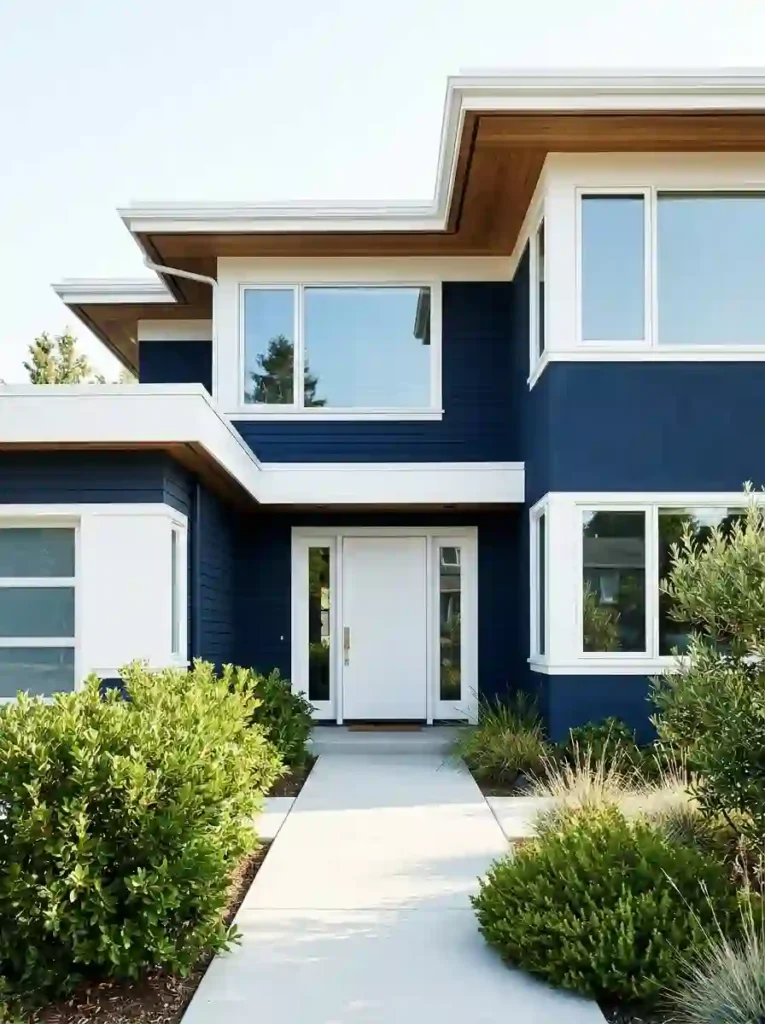
1. Navy Blue and White
- Navy blue gives your home a bold, confident, and timeless look
- White trim creates sharp contrast that makes architectural details pop
- This pairing works beautifully on both traditional and modern home styles
- The combination photographs exceptionally well for listings and social media
- It holds its color integrity longer than lighter shades in most climates
Navy blue is one of those colors that simply commands attention. The moment you paint your home in this shade, the whole street notices. I’ve seen this work beautifully on both brick-base homes and wood-panel exteriors; the depth of the color adds instant sophistication.
What makes this combo truly powerful is the white trim. It sharpens every edge, every window frame, every roofline. Your home stops looking flat and starts looking architectural. That’s why many designers recommend this as one of the best exterior color schemes for curb appeal; it works across every season and every style.
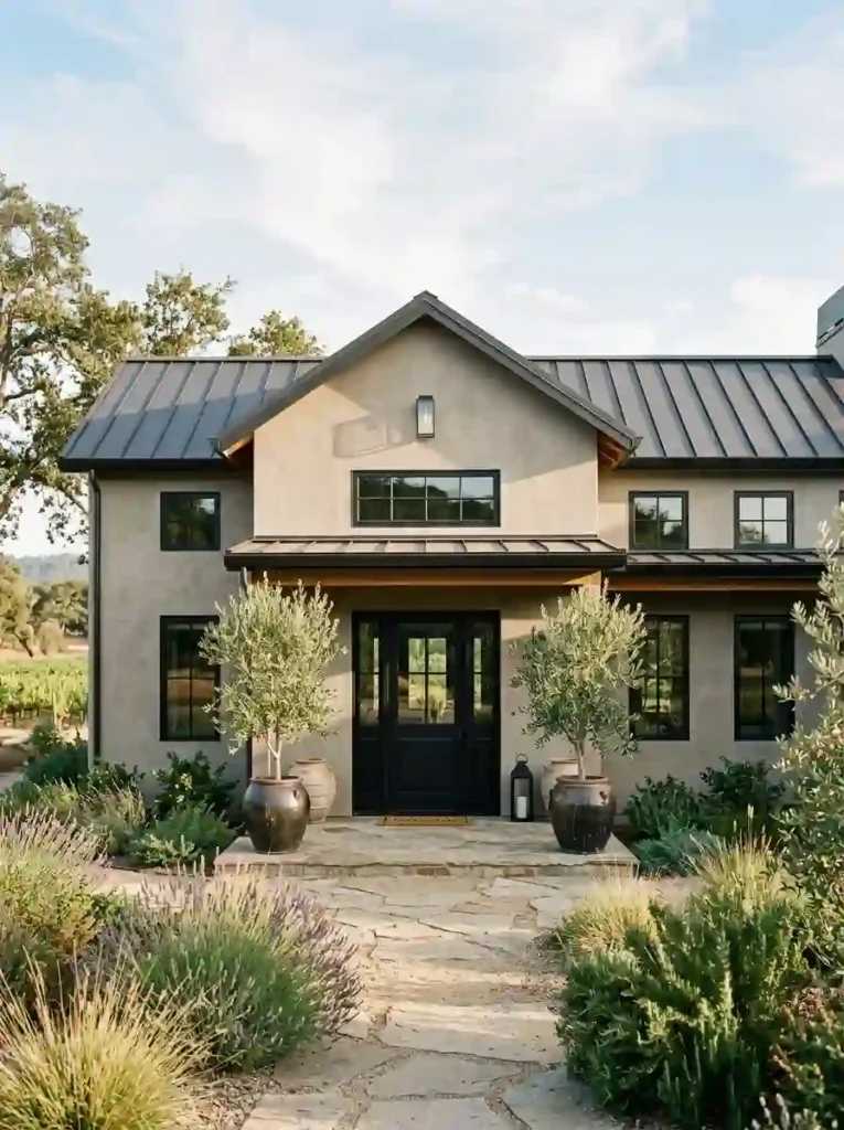
2. Warm Greige and Black Trim
- Greige (gray + beige) is the perfect neutral that feels warm, not cold
- Black trim adds a modern, high-contrast edge without feeling aggressive
- This palette suits ranch-style, craftsman, and contemporary homes equally
- It pairs well with natural stone, wood accents, and drought-tolerant landscaping
- Greige stays stylish across years without feeling trendy or dated
Greige is that rare exterior color that makes your home look expensive without trying too hard. It sits beautifully in both sunny and overcast lighting which is something most paint colors fail to do. In my experience, homeowners who choose greige almost never regret it five years later.
Add matte black trim and you immediately elevate the whole facade. The contrast is subtle but powerful. Black frames the windows like a painting suddenly every architectural detail becomes intentional and design-forward. It is a quiet upgrade with a dramatic result.
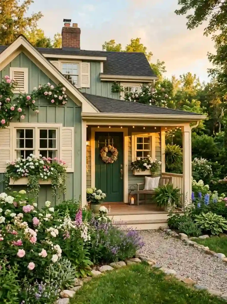
3. Sage Green and Cream
- Sage green connects your home visually to its surrounding landscape and garden
- Cream trim feels softer and warmer than stark white more timeless and livable
- This color combination works especially well in suburban and countryside settings
- Flower boxes and greenery enhance this palette naturally and beautifully
- It creates an inviting, Pinterest-worthy curb appeal that feels handcrafted
There is something deeply calming about a sage green home. It does not shout, it whispers elegance. I’ve noticed that homes with this exterior color tend to draw genuine compliments from neighbors, not just passing glances. It feels intentional, warm, and deeply human.
The cream trim is the detail that holds everything together. Pure white would feel too sharp here cream softens the contrast and makes the whole facade feel cohesive. Based on what I’ve seen, this pairing tends to age gracefully, looking just as fresh after ten years as it did on day one.
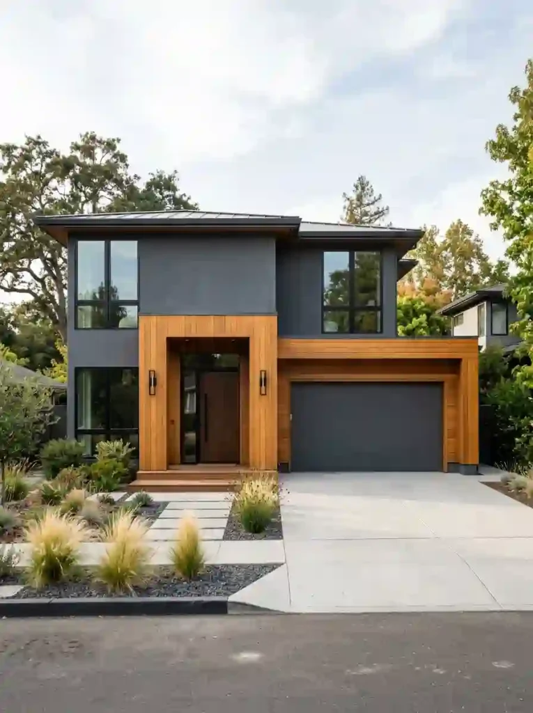
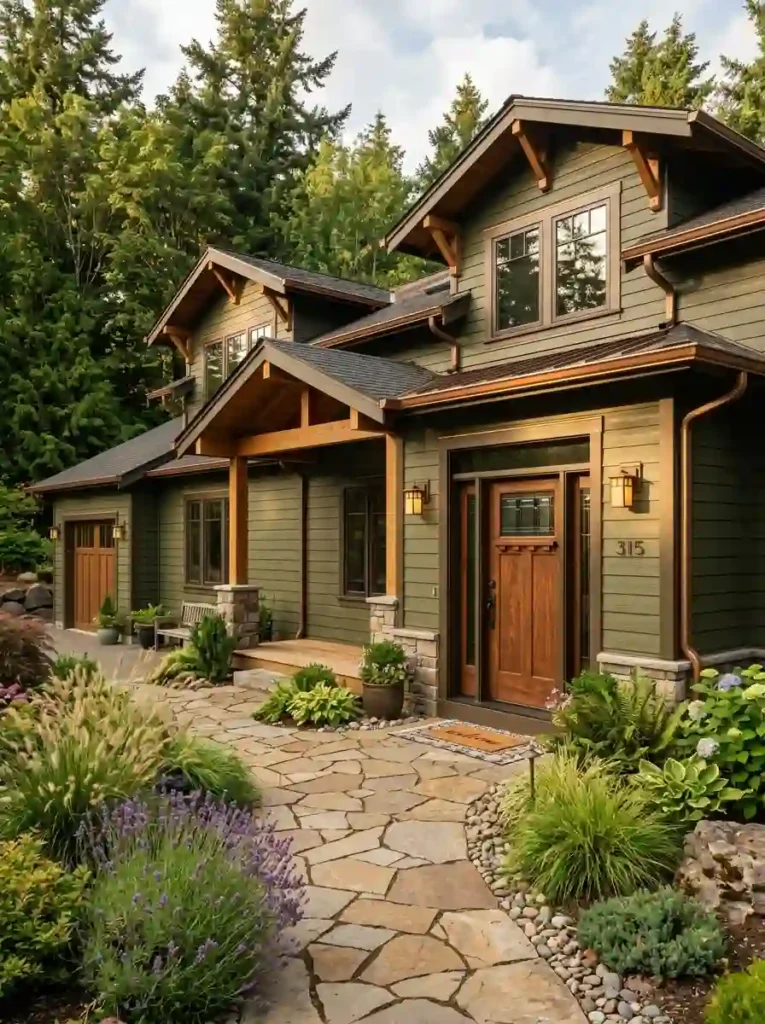
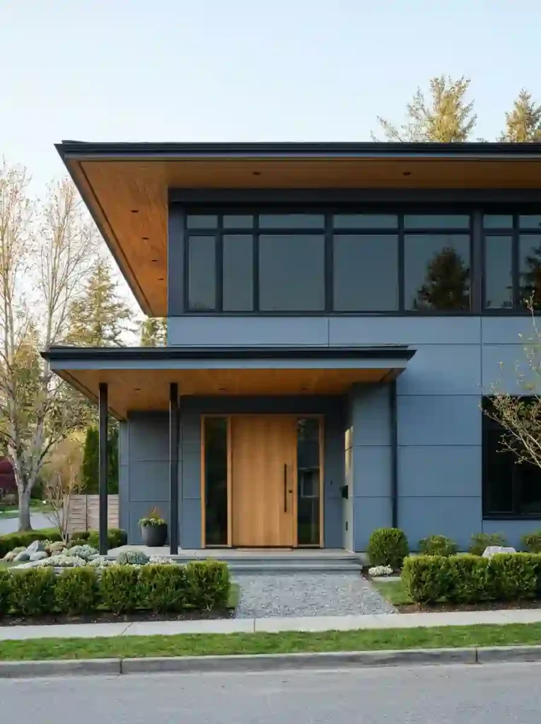
4. Charcoal Gray and Wood Accents
- Charcoal gray creates a strong, modern foundation that feels sleek and grounded
- Natural wood accents add warmth that prevents the exterior from feeling too cold
- This contrast between raw wood and smooth gray is a hallmark of contemporary design
- Cedar or teak panels work especially well around garages and entryways
- The combination photographs beautifully in both bright daylight and overcast skies
Charcoal gray is one of those exterior colors that looks like it belongs in an architecture magazine. It is bold without being loud. I’ve seen this work incredibly well on homes that previously felt flat or forgettable. One coat of deep charcoal completely transforms the personality of the facade.
The wood accents are what bring the human touch back. Without them, charcoal can feel cold and industrial. But add a cedar panel above the garage or around the front door and suddenly the whole home feels balanced. That contrast between raw nature and modern finish is what makes this one of the most pinned exterior color ideas today.
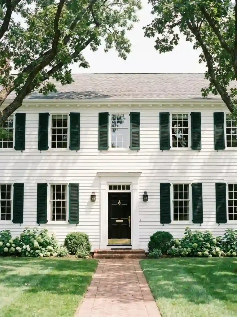
5. Classic White and Forest Green Shutters
- Bright white siding gives your home a fresh, clean slate that never goes out of style
- Forest green shutters add rich color contrast without overpowering the overall look
- This is one of the most timeless and trusted exterior color pairings in home design
- A black front door completes the trio and adds sophistication to the entryway
- Works beautifully on colonial, craftsman, and traditional-style homes
There is a reason this color combination has survived decades of changing design trends. White and forest green simply work on almost every home style, in almost every neighborhood. In my experience, this pairing increases perceived home value more than almost any other exterior update.
The shutters are the secret ingredient here. They frame every window like a portrait and give the facade visual rhythm and structure. That’s why many designers recommend starting with white as your base when you are unsure it gives you the freedom to experiment with accent colors like forest green without a full commitment.
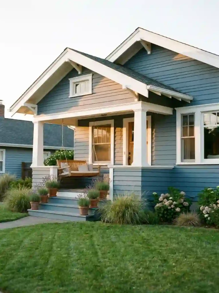
6. Dusty Blue and White Trim
- Dusty blue is softer than navy but still carries strong visual presence and character
- White trim keeps the look crisp and prevents the blue from feeling heavy or dark
- This palette is especially popular for craftsman bungalows and cottage-style homes
- It creates a relaxed, coastal-inspired vibe that feels welcoming and effortlessly styled
- Lavender, white, and silver plants complement this exterior color beautifully
Dusty blue sits in that perfect middle ground; it is not as safe as gray but not as bold as navy. It has personality without being aggressive. I’ve noticed that homes with dusty blue exteriors tend to have the kind of curb appeal that makes people slow down when they drive past.
Pair it with white trim and you get instant brightness and clarity. The white outlines every architectural detail and makes the whole home feel intentional and well-designed. From my perspective, this is one of the most underrated exterior color combinations available. It delivers serious curb appeal without the commitment of a darker shade.
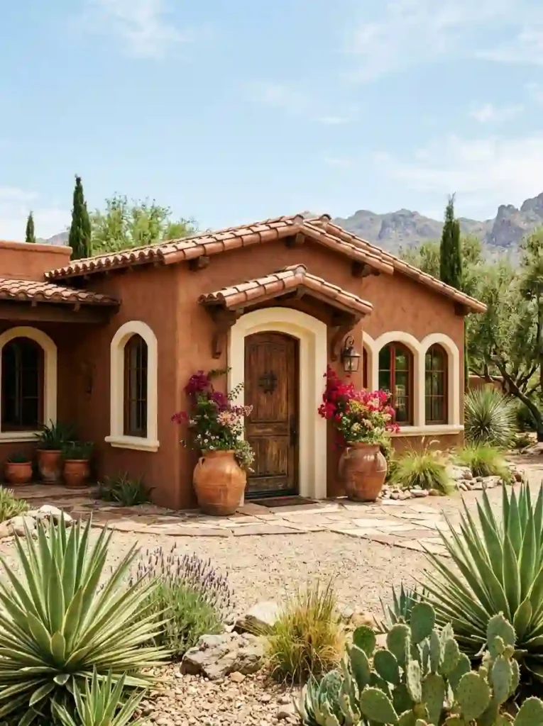
7. Terracotta and Cream
- Terracotta brings an earthy, sun-warmed richness that feels grounded and deeply inviting
- Cream trim softens the intensity of terracotta without dulling its natural warmth
- This palette works exceptionally well on stucco, adobe, and Mediterranean-style homes
- It pairs naturally with clay pots, wooden doors, and drought-resistant landscaping
- Terracotta reflects warm light beautifully during golden hour, making your home glow
Terracotta is having a well-deserved comeback and it is not hard to see why. It connects your home to the earth in a way that feels both ancient and completely modern. I’ve seen this color transform flat, forgettable stucco homes into warm, character-rich statements that look straight out of a design magazine.
The cream trim is essential here; it keeps the look refined and prevents terracotta from feeling too rustic or heavy. Together they create a facade that feels sun-soaked and welcoming at every hour of the day. Based on what I’ve seen, this combination performs especially well in warmer climates where natural light amplifies the warmth of the palette.
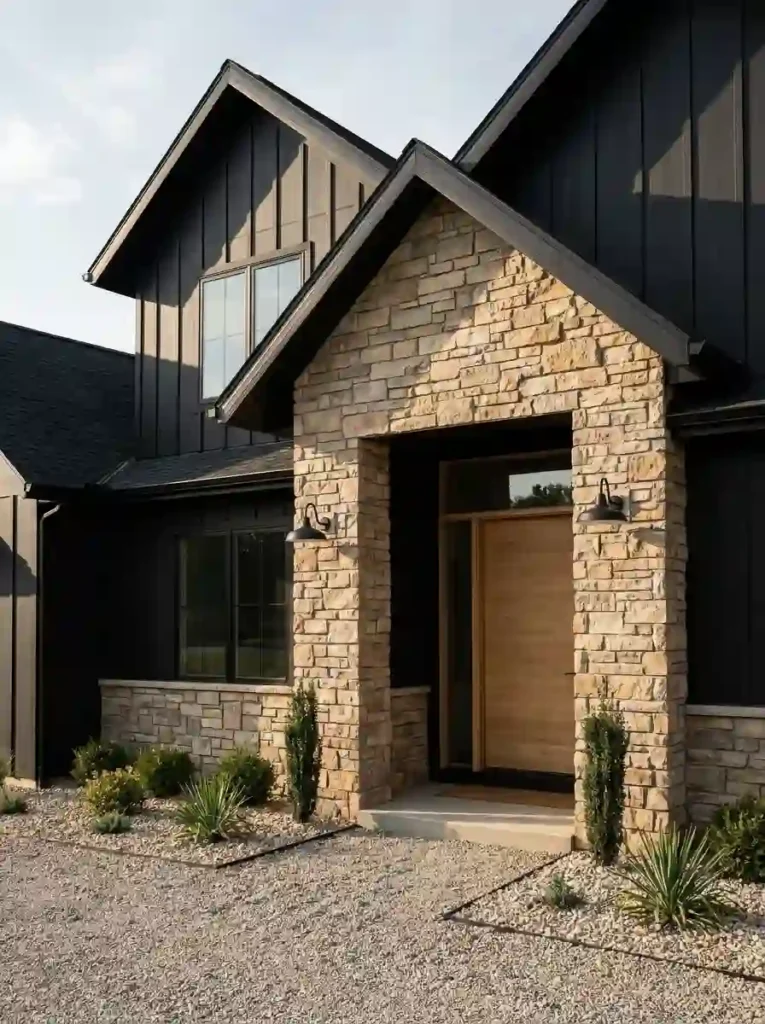
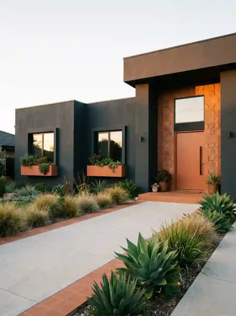
8. Black and Natural Stone
- Matte black creates one of the most dramatic and high-impact exterior looks available
- Natural stone grounds the darkness and adds organic warmth and beautiful texture
- This combination signals luxury and architectural confidence from the street
- The contrast between smooth black siding and rough stone is visually stunning and layered
- It works best on modern farmhouse, contemporary, and transitional home styles
Black exteriors are not for the timid and that is exactly what makes them so memorable. A matte black home with natural stone accents does not just have curb appeal, it has presence. I’ve seen entire neighborhoods take notice when one homeowner makes this bold move.
The stone is what makes this work beyond just being dramatic. It adds texture, warmth, and a connection to nature that pure black alone cannot provide. That’s why many designers recommend pairing black siding with stone rather than brick or wood. Stone carries a timeless, almost elemental quality that elevates the entire facade to another level entirely.
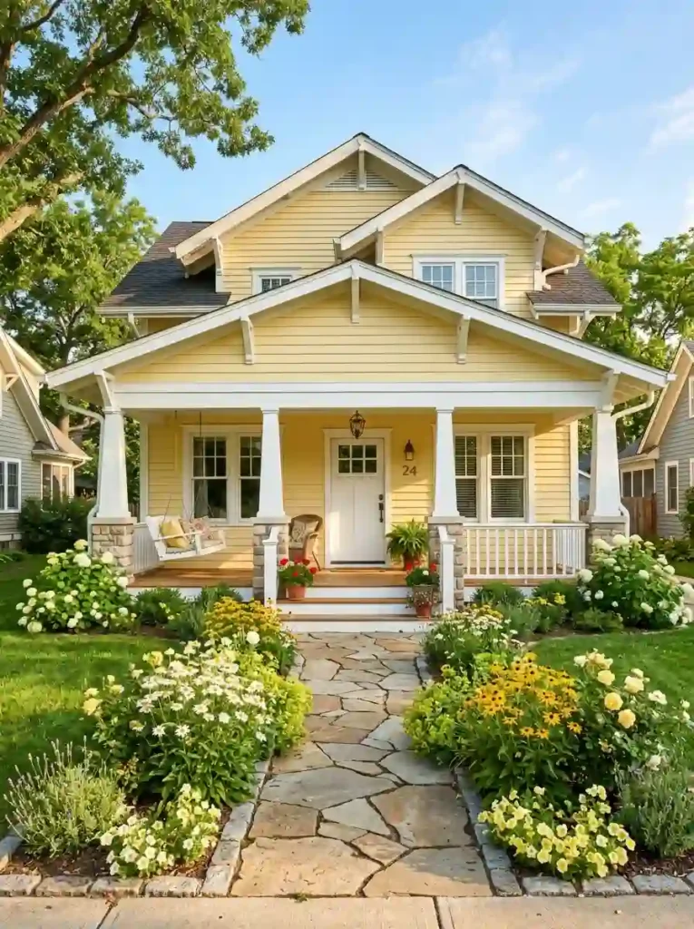
9. Soft Yellow and White
- Soft yellow creates an instantly cheerful and welcoming exterior that stands out warmly
- White trim keeps the look fresh, clean, and prevents yellow from feeling overwhelming
- This is one of the most neighborhood-friendly color choices approachable and bright
- Morning sunlight makes soft yellow exteriors look absolutely stunning and photogenic
- Flower beds in matching warm tones complete this look naturally and beautifully
Soft yellow is one of those exterior colors that makes people smile before they even reach the front door. It radiates warmth, friendliness, and a kind of timeless optimism that very few other colors can match. In my experience, yellow homes always feel like someone genuinely loves living there.
The key is keeping it soft and buttery, not bright or neon. A muted, warm yellow reads as elegant and considered rather than loud. Pair it with crisp white trim and you have a facade that feels both classic and completely fresh. This combination works especially well on craftsman bungalows and cottage-style homes where the architecture already has natural warmth and character.
10. Deep Olive and Bronze Trim
- Deep olive green feels rich and earthy without the boldness of darker greens
- Bronze trim adds a warm metallic accent that feels elevated and intentionally styled
- This combination works beautifully on craftsman, Tudor, and transitional home styles
- It connects your home visually to surrounding trees and natural landscape elements
- The earthy palette photographs with exceptional depth and warmth in natural light
Deep olive is one of those colors that reveals its true beauty slowly. It shifts and deepens depending on the light cooler in the morning, richer and warmer by afternoon. I’ve noticed that homeowners who choose this shade often say it looks better six months after painting than it did on day one.
The bronze trim is the detail that separates this look from standard green exteriors. It adds a layer of warmth and intentionality that instantly signals good design taste. From my perspective, this pairing is one of the most underused combinations in residential exteriors and that is precisely what makes it so distinctive and memorable when you see it on a real home.
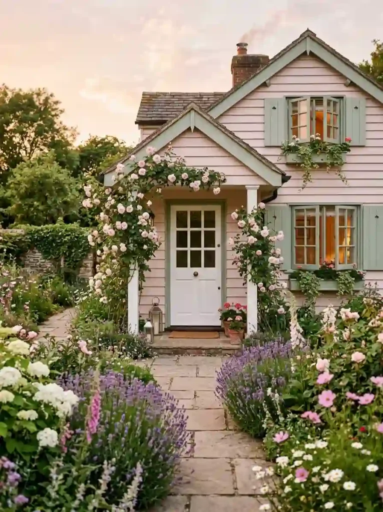
11. Pale Pink and Sage
- Pale pink creates a dreamy, romantic exterior that feels genuinely one of a kind
- Sage green trim and shutters ground the pink and prevent it from feeling too sweet
- This combination is deeply popular on Pinterest for its soft, editorial, cottagecore aesthetic
- It works best on cottage, Victorian, and bungalow-style homes with natural landscaping
- Climbing roses, lavender, and white blooms enhance this palette effortlessly and naturally
Pale pink is a surprisingly versatile exterior color when handled with confidence and care. It is not loud or flashy, it is soft, considered, and deeply personal. I’ve seen this color stop people mid-scroll on Pinterest more consistently than almost any other exterior palette, and that says everything.
The sage green is what gives this combination its grounding and balance. Without it, pale pink risks feeling too delicate or one-dimensional. But together, these two muted tones create a facade that feels like it grew naturally from the garden surrounding it. That’s why many designers recommend this pairing specifically for homes with mature trees, climbing vines, and established garden beds.
12. Slate Blue and Warm Wood
- Slate blue sits between gray and blue sophisticated, calm, and effortlessly modern
- Warm wood accents on soffits and porch ceilings add organic contrast and visual comfort
- This pairing balances cool and warm tones in a way that feels perfectly calibrated
- It works beautifully on contemporary, modern farmhouse, and transitional home styles
- Large black-framed windows complete this look with sharp architectural definition
Slate blue is a color that performs brilliantly in almost every lighting condition. It reads as calm and composed in bright sun, and takes on a deeper, moodier quality on overcast days. In my own experience, this is one of those exterior colors that never fights with its surroundings; it simply belongs.
The warm wood accents are essential to making this combination feel livable rather than just visually striking. They soften the coolness of the slate blue and invite the eye inward toward the entry. Based on what I’ve seen, homes that combine cool siding tones with warm natural wood details consistently achieve the kind of balanced curb appeal that appeals equally to design lovers and everyday homebuyers alike.
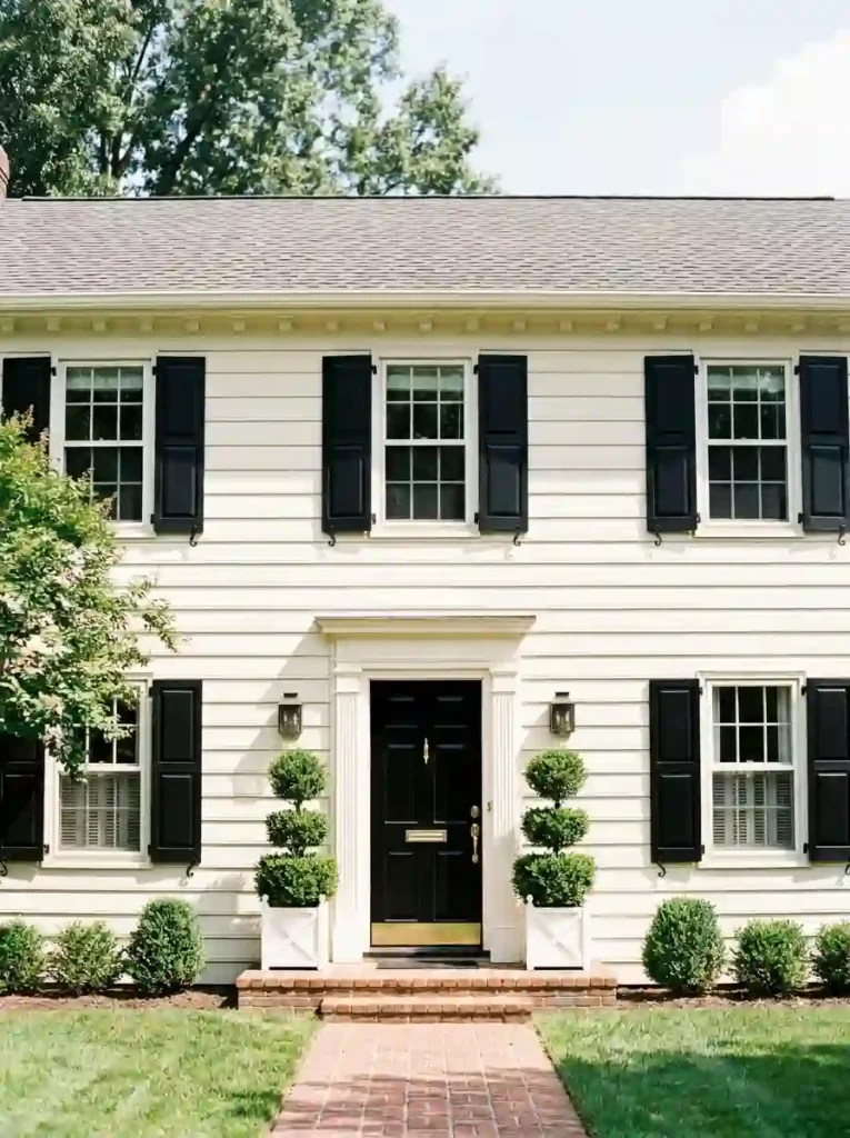
13. Creamy White and Black Shutters
- Creamy white feels warmer and more livable than stark white without losing its brightness
- Matte black shutters create bold graphic contrast that sharpens every window on the facade
- This is one of the most timeless and universally appealing exterior color combinations available
- Brass or gold hardware details add a touch of warmth that elevates the overall look beautifully
- It works equally well on colonial, farmhouse, and traditional style homes of any size
Creamy white is what happens when you want the brightness of white but with more soul. It catches warm light beautifully and never looks harsh or clinical from the street. I’ve noticed that homes painted in creamy white tend to photograph warmer and more inviting than those painted in pure brilliant white.
The black shutters are the element that gives this look its backbone and structure. They frame every window with confidence and create a graphic rhythm across the entire facade. That’s why many designers recommend this combination as a starting point for homeowners who want serious curb appeal without taking a big color risk; it delivers maximum impact through contrast rather than color.
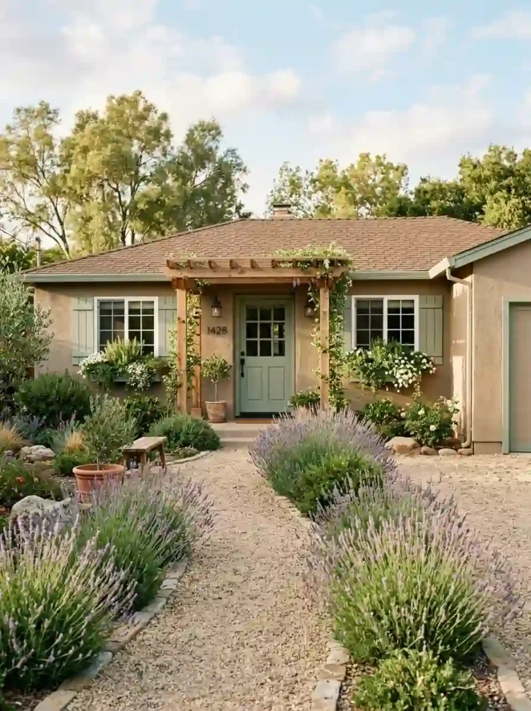
14. Warm Taupe and Sage Accents
- Warm taupe is one of the most versatile and universally flattering neutral exterior colors
- Sage green accents add natural color without disrupting the calm, grounded overall palette
- This combination feels deeply connected to the landscape and surrounding natural environment
- Window boxes with trailing herbs and blooms enhance this palette in the most organic way
- It suits ranch, Mediterranean, and contemporary single-story homes exceptionally well
Warm taupe has a quiet confidence that is genuinely hard to replicate with trendier colors. It does not demand attention; it earns it slowly, through texture, warmth, and a sense of permanence. In my experience, taupe exteriors age more gracefully than almost any other color choice across changing seasons and years.
Adding sage green accents brings the whole facade to life without disrupting its calm foundation. The green pulls your eye to the entry details, the door, the window boxes, the shutters and creates a gentle visual journey from the street to the front door. Based on what I’ve seen, this kind of layered, nature-connected palette consistently ranks among the most saved exterior color ideas across Pinterest boards worldwide.
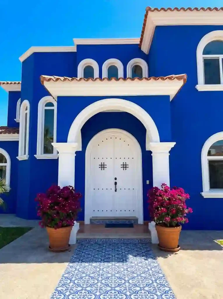
15. Cobalt Blue and White
- Cobalt blue is one of the most visually striking and scroll-stopping exterior color choices available
- Bright white trim amplifies the intensity of cobalt and creates razor-sharp architectural contrast
- This combination is deeply rooted in Mediterranean and Greek island design traditions
- Bougainvillea, terracotta pots, and iron hardware complete this palette with authentic character
- It photographs with extraordinary color saturation in bright natural sunlight conditions
Cobalt blue is not a color for blending in and that is entirely the point. It announces your home with confidence, warmth, and a sense of sun-drenched joy that very few exterior colors can match. I’ve seen this color used on homes in both coastal and inland settings, and it consistently delivers the same result with a pure, undeniable visual impact.
The white trim is absolutely critical here. It gives the cobalt room to breathe and prevents the facade from feeling overwhelming or visually heavy. Together, cobalt and white create one of the most instantly recognizable and Pinterest-worthy exterior color pairings in residential design, bold, timeless, and utterly impossible to scroll past without stopping.
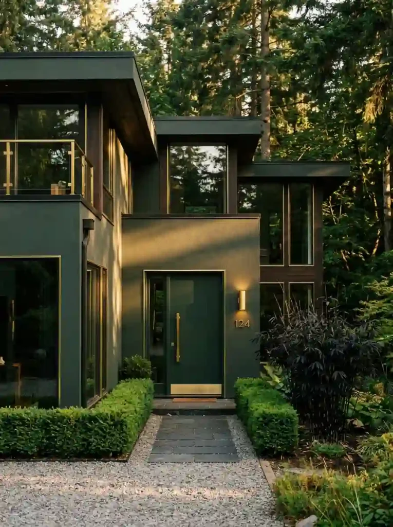
16. Moody Green and Brass
- Deep moody green creates one of the most luxurious and design-forward exterior looks available
- Brass accents add warmth and richness that prevent the dark green from feeling cold or flat
- This combination signals sophisticated design taste and intentional architectural thinking
- It works beautifully on modern, contemporary, and transitional homes with clean lines
- The pairing photographs with extraordinary depth and moodiness in golden hour light
Moody green is the exterior color choice of homeowners who genuinely love design. It is not trying to blend in or play it safe, it is making a considered, confident statement about taste and intention. In my experience, this is one of those colors that looks even better in person than it does in photographs, which is saying something given how stunning it photographs.
The brass accents are what transform this from simply dark to genuinely luxurious. Every fixture, every handle, every house number becomes a deliberate design detail. That’s why many designers recommend committing fully to the brass hardware when choosing a moody green exterior; the more intentional and consistent the metallic details, the more elevated and cohesive the entire facade becomes.
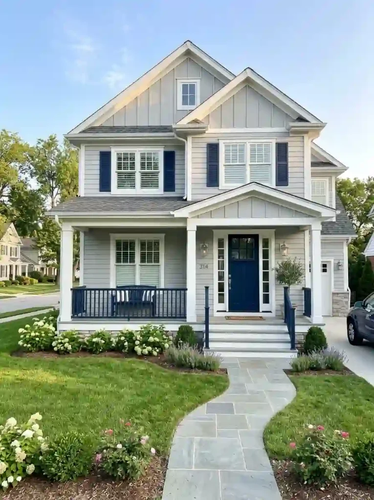
17. Soft Gray and Navy Accents
- Soft gray is the ultimate neutral exterior base calm, versatile, and endlessly adaptable
- Navy accents inject bold color personality without overwhelming the overall balanced palette
- White trim ties everything together and sharpens the architectural details beautifully
- This three-color combination creates a layered, professional exterior that feels complete
- It suits craftsman, contemporary, and transitional homes across every climate and region
Soft gray is the exterior color equivalent of a perfect white shirt; it works with everything and always looks intentional. It is neither warm nor cold, neither bold nor boring. I’ve noticed that gray exteriors tend to make surrounding landscaping colors pop more vividly, which gives the whole property a more polished and well-considered appearance.
The navy accents are where the personality lives in this combination. A navy front door alone can completely transform the energy of a gray home making it feel confident, coastal, and curated all at once. From my perspective, this is one of the most reliable and rewarding exterior color combinations for homeowners who want strong curb appeal without the risk of choosing something too bold or too trendy.
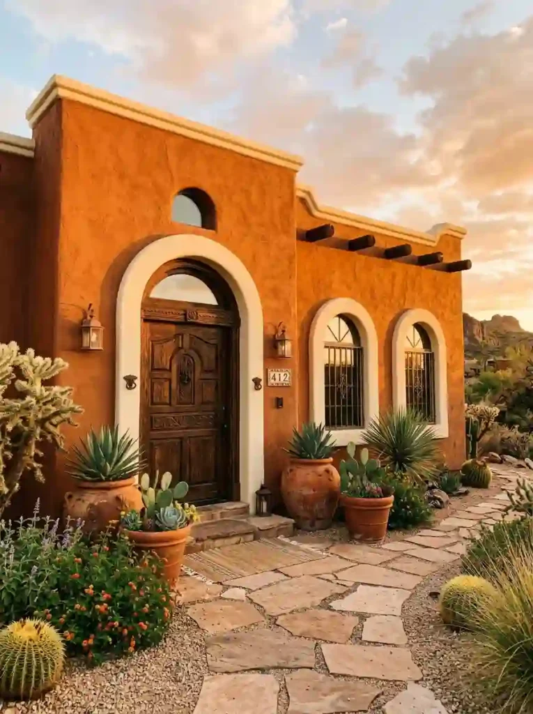
18. Rust Orange and Cream
- Rust orange is a bold and deeply earthy exterior color that radiates warmth and personality
- Cream trim softens the intensity of rust and gives the facade clean architectural definition
- This palette is authentically rooted in southwestern, adobe, and desert-style home design
- It looks most stunning during golden hour when warm sunlight deepens the rust tones
- Desert plants, carved wood doors, and terracotta pots complete this look with natural authority
Rust orange is a color with a genuine soul. It does not arrive quietly; it brings warmth, history, and a sun-baked richness that immediately makes a home feel like it belongs to its landscape. In my own experience, this color works most powerfully on homes with textured stucco or adobe surfaces where the paint can settle into every groove and imperfection beautifully.
The cream trim is the essential counterbalance here. Without it, rust orange can feel too heavy and visually overwhelming on a large facade. But add cream around the windows and roofline and suddenly the whole exterior finds its balance bold and warm in the body, clean and refined at the edges. Based on what I’ve seen, this combination consistently delivers the kind of authentic, characterful curb appeal that photographs beautifully in every season.
19. Charcoal and Terracotta Accents
- Deep charcoal creates a dramatic, architectural foundation that makes accent colors truly sing
- Terracotta accents bring unexpected warmth that completely transforms the charcoal exterior
- This combination balances modern boldness with earthy, organic character beautifully
- It works exceptionally well on contemporary and transitional homes with clean flat surfaces
- The earthy contrast between charcoal and terracotta photographs with remarkable visual depth
Charcoal and terracotta is one of those combinations you do not see everywhere and that is exactly what makes it so powerful when you do. The dark base creates a stage and the terracotta accents perform on it with warmth and confidence. I’ve seen this pairing turn completely ordinary contemporary homes into genuine neighborhood landmarks.
The key is restraint with the terracotta. It works best as an accent on the front door, the window boxes, a decorative tile border rather than a competing color. That controlled use of warmth against the cool charcoal background is what creates the visual tension that makes this exterior so compelling and memorable. That’s why many designers recommend this combination specifically for homeowners who want drama without sacrificing sophistication.
20. Pale Blue and Natural Wood
- Pale blue creates a serene, airy exterior that feels calm and welcoming from the street
- Natural pine wood accents add organic warmth that perfectly balances the cool blue tones
- This Scandinavian-inspired combination feels fresh, minimal, and deeply considered
- White trim keeps the overall look crisp and prevents the palette from feeling too casual
- It works beautifully on single-story homes with simple clean architectural lines
Pale blue is one of those exterior colors that makes a home feel genuinely restful just from the street. There is something deeply calming about it; it does not demand your attention, it simply invites it. In my experience, homeowners who choose pale blue exteriors consistently describe feeling more peaceful arriving home every single day.
The natural wood accents are what give this palette its soul and warmth. Without them, pale blue risks feeling cold or too Nordic for warmer climates. But add natural pine on the porch ceiling or pergola beams and the whole exterior finds a beautiful balance between cool and warm, minimal and inviting. Based on what I’ve seen, this combination works particularly well in coastal, suburban, and wooded settings where the natural surroundings echo the palette organically.
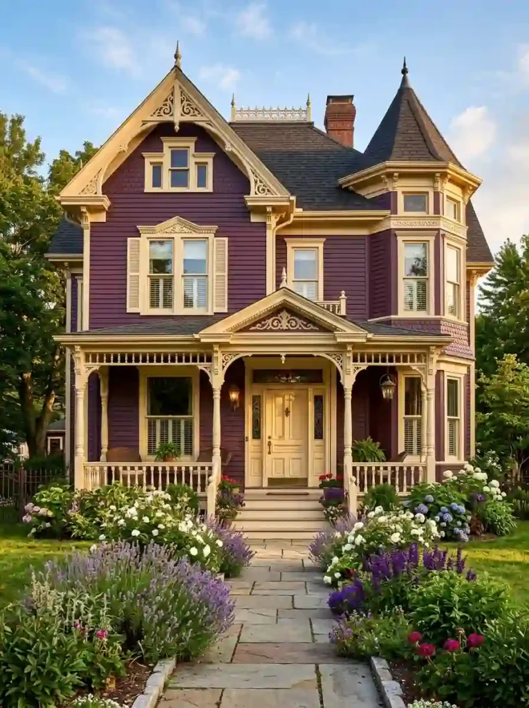
21. Deep Plum and Cream
- Deep plum is one of the most dramatic and character-rich exterior colors for historic homes
- Cream trim highlights every ornate architectural detail and makes the craftsmanship truly shine
- This combination is authentically rooted in Victorian and historic home design traditions
- Lavender, roses, and purple blooms in the garden echo the plum tones with natural elegance
- It creates a genuinely unforgettable curb appeal that is impossible to walk past without admiring
Deep plum on a Victorian home is not just a color choice it is a love letter to the architecture itself. Every ornate detail, every carved bracket, every decorative gable becomes a canvas for this rich, complex color. I’ve seen this transformation happen on homes that were previously painted in flat beige, and the difference is nothing short of extraordinary.
The cream trim is absolutely essential here. It traces every architectural detail with precision and clarity, turning what could feel heavy and dark into something theatrical and celebratory. From my perspective, this is the exterior color combination that best honors the spirit of Victorian architecture: bold, expressive, deeply personal, and completely committed to making a statement that reflects genuine pride in your home and its history.
Your home deserves a color that makes you proud every single time you pull into the driveway. These 21 ideas prove that the best exterior color schemes for curb appeal are not just about trends, they are about finding the combination that feels authentically yours.
I’ve seen how one thoughtful color change can completely transform how a home feels from the street. It is one of the highest-impact, most rewarding upgrades any homeowner can make.
Save this post on Pinterest, share it with someone planning a refresh, and start imagining your perfect exterior today. Your dream home starts right here.