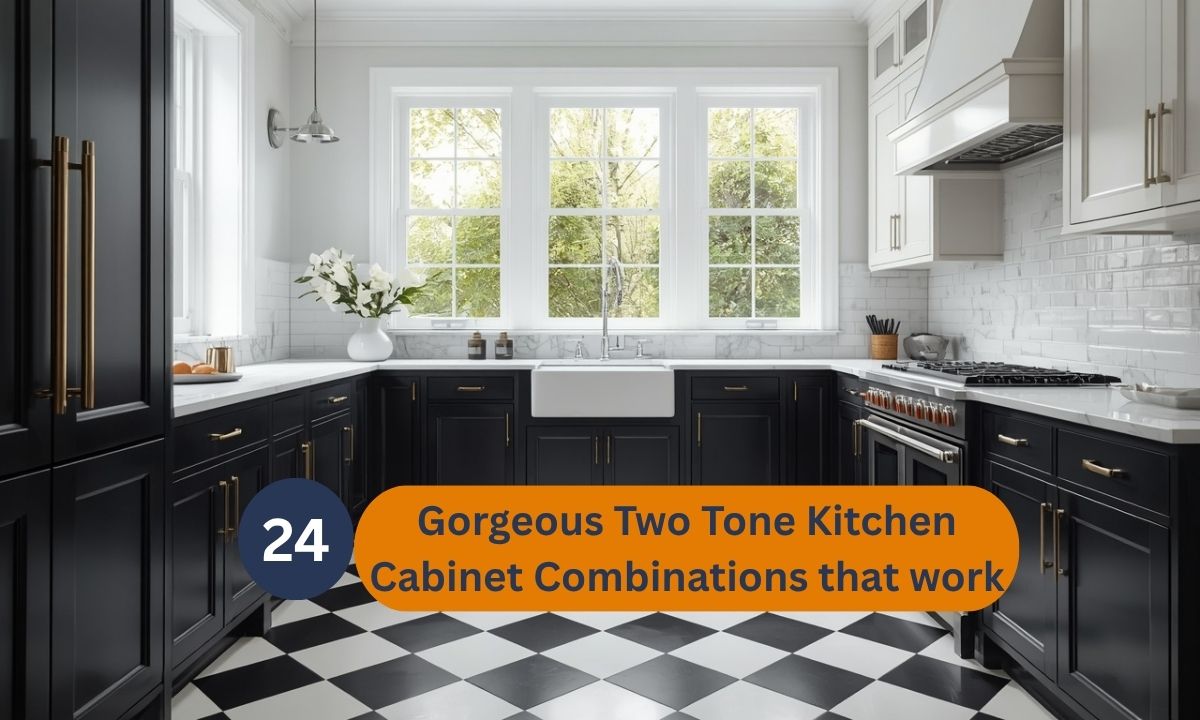
24 Gorgeous Two Tone Kitchen Cabinet Combinations that work
Introduction
Staring at your kitchen wondering if it needs a refresh? You’re not alone. Two tone kitchen cabinet combinations have quietly become one of the most popular ways to transform a space without a full renovation.
This simple design choice adds depth, personality, and visual interest instantly. Whether you love bold navy, soft sage, or classic black and white, there’s a pairing here that fits your home perfectly.
In my experience, homeowners often assume two-tone cabinets require major structural changes. That’s rarely true. A thoughtful color pairing can completely shift how a kitchen feels, without touching layout or appliances.
I’ve seen this approach work in tiny galley kitchens and sprawling open-concept spaces alike. The right combination doesn’t just look beautiful. It makes the kitchen feel more intentional, more curated, and genuinely more like home.
Below, you’ll find 24 gorgeous ideas to inspire your next kitchen update, each one ready to save and revisit.

Navy and Brass
● Adds instant richness without feeling heavy or dark
● Brass hardware brings warmth against the cool navy tone
● Works beautifully in both small and large kitchen layouts
● Creates a timeless look that rarely feels outdated
● Pairs well with white or marble countertops for contrast
Navy blue never really goes out of style in kitchen design. This shade adds depth without making the room feel closed in. It works in tiny galley kitchens and open-concept spaces alike.
In my experience, pairing navy with brass hardware makes the whole kitchen feel intentional. The warm metal tones soften the boldness of the blue. It creates a balance that feels curated, not accidental.
White countertops or backsplash tiles help brighten the space further. Natural light bounces off lighter surfaces and keeps the room airy. This combination photographs beautifully for Pinterest boards too.

Sage Green Contrast
● Brings a calming, nature-inspired feel into the kitchen
● Soft green tones pair beautifully with wood accents
● Feels fresh without being too bold or trendy
● Works well in farmhouse, cottage, or modern spaces
● Easy to style with neutral countertops and open shelves
Sage green feels like bringing the outdoors into your kitchen. It’s soft enough to stay neutral but adds real personality. This shade suits almost any home style effortlessly.
I’ve noticed sage green ages better than brighter greens. It doesn’t feel like a passing trend after a year or two. That’s why many designers recommend it for long-term renovations.
Wood shelving or accents complete this look naturally. The combination feels grounded, warm, and inviting every single day. It’s a color pairing that photographs well in every lighting condition.

Charcoal and Oak
● Creates a striking modern contrast that feels intentional
● Oak wood softens the darkness of charcoal tones
● Great for minimalist or Scandinavian-inspired kitchens
● Hides fingerprints and daily wear better than lighter shades
● Adds warmth to an otherwise cool color scheme
Charcoal and oak together create a quietly dramatic kitchen look. The dark tone anchors the space while wood keeps it warm. This pairing feels both modern and livable at once.
I’ve tried this combination in smaller kitchens with great results. Charcoal doesn’t shrink the room the way people expect it to. Good lighting keeps everything feeling open and grounded.
This two-tone kitchen cabinet combination works especially well with brass or black fixtures. The oak adds texture that charcoal alone can’t provide. It’s a pairing that feels current and lasting.

Blush Pink Accent
● Adds a soft, feminine touch without overwhelming the space
● Pairs beautifully with gold or brass hardware accents
● Feels fresh, light, and welcoming in daytime lighting
● Works well in cottage, modern, or transitional kitchens
● Balances boldness with a neutral white counterpart
Blush pink brings unexpected warmth into a kitchen space. It feels playful without tipping into overly sweet territory. This shade works surprisingly well in modern homes too.
I’ve seen this work beautifully in kitchens with lots of natural light. The pink softens as sunlight hits the cabinet surfaces. It creates a glowing, welcoming feel throughout the day.
Gold hardware makes this pairing feel polished and elevated. White countertops keep the overall look balanced and airy. It’s a combination that stands out on any Pinterest board.
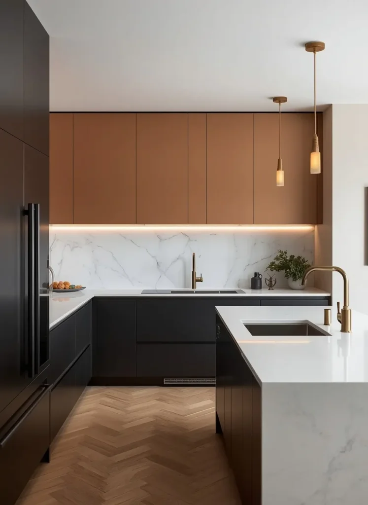
Matte Black Base
● Grounds the kitchen with a bold, confident base
● Creates strong visual contrast against lighter uppers
● Hides daily smudges and marks better than white cabinets
● Feels dramatic without making the space feel small
● Pairs beautifully with marble or quartz countertops
Matte black cabinets add instant drama to any kitchen. This tone works as an anchor rather than the main focus. It lets other design elements shine around it.
From my perspective, black lower cabinets feel less risky than people assume. Keeping the uppers white balances the entire room. The result feels bold but never overwhelming.
Marble countertops add movement and softness to this pairing. Warm lighting keeps the black from feeling too stark or cold. It’s a combination built for long-term style.

Warm Terracotta Blend
● Adds warmth and earthy character to modern kitchens
● Works beautifully with natural materials like stone and wood
● Feels cozy without making the kitchen look outdated
● Pairs well with cream, beige, or warm white tones
● Brings a sunny, inviting feeling into the whole room
Terracotta is having a real moment in kitchen design right now. This earthy tone brings warmth without feeling like a bold statement. It suits Mediterranean, rustic, and modern farmhouse styles.
I’ve noticed this shade works best with natural materials nearby. Stone countertops and wood beams enhance the earthy feel. The whole space starts to feel sun-soaked and lived-in.
Cream uppers keep the palette from feeling too heavy or dark. This pairing photographs wonderfully in warm afternoon light. It’s a look that feels both trendy and timeless.

Deep Emerald Elegance
● Brings a luxurious, jewel-toned feel to the kitchen
● Pairs beautifully with brass, gold, or marble accents
● Feels rich and elegant without being overly formal
● Works well in traditional and modern kitchen styles
● Adds depth and personality to an otherwise neutral space
Emerald green feels like a quiet luxury choice for kitchens. This deep tone adds richness without overwhelming the senses. It suits homes that want a touch of drama.
In my experience, emerald pairs best with warm metal accents. Brass or gold hardware lifts the color instantly. The combination feels curated and thoughtfully designed.
Marble countertops add sparkle and softness against the deep green. Layered lighting keeps the space feeling warm, not moody. It’s a pairing that feels genuinely upscale.

Two-Tone Island Focus
● Makes the island the clear focal point of the kitchen
● Keeps the rest of the space light and open
● Great option for renters or partial kitchen updates
● Adds personality without a full cabinet overhaul
● Works with almost any two tone kitchen cabinet combination
Making the island a different color instantly draws the eye. This idea works even when the rest of the kitchen stays neutral. It’s an easy way to add personality affordably.
I’ve tried recommending this to homeowners on a budget. Painting just the island cabinets costs far less than a full redo. The visual impact still feels significant and intentional.
White perimeter cabinets keep the space feeling bright and open. The island becomes a natural gathering spot visually and physically. This layout photographs beautifully from almost any angle.

Soft Grey Duo
● Creates a soft, calming contrast that suits any home
● Feels neutral enough to match multiple design styles
● Easy to update with colorful decor or accessories later
● Works well in small kitchens needing a light touch
● Offers a subtle two-tone look without bold commitment
Soft grey feels like the safest way to try two-tone cabinets. It offers contrast without committing to anything too bold. This works well for first-time renovators especially.
I’ve seen this work well in smaller kitchens needing light. Grey doesn’t absorb light the way darker tones sometimes do. The space stays feeling open and calm throughout the day.
Nickel or chrome hardware complements this pairing effortlessly. Quartz countertops with subtle veining tie the whole look together. It’s a gentle, livable approach to two-tone design.
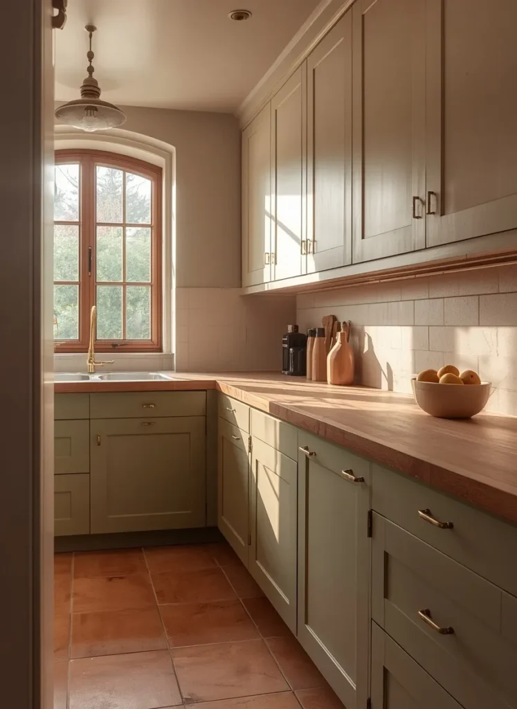
Olive and Cream
● Brings an earthy, vintage-inspired charm to modern kitchens
● Pairs beautifully with wood countertops and warm metals
● Feels cozy and lived-in rather than overly styled
● Works well in farmhouse and Mediterranean-inspired spaces
● Adds subtle color without feeling too bold or trendy
Olive green has quietly become a favorite among kitchen designers. This muted tone feels earthy without leaning too rustic or dated. It suits homes wanting warmth over stark modernism.
Based on what I’ve seen, olive pairs beautifully with butcher block countertops. The wood grain enhances the green’s natural, organic feel. Together they create a relaxed, welcoming atmosphere.
Cream uppers keep this pairing from feeling too heavy overall. Brass hardware adds a subtle vintage touch throughout. This combination feels timeless rather than tied to one trend.
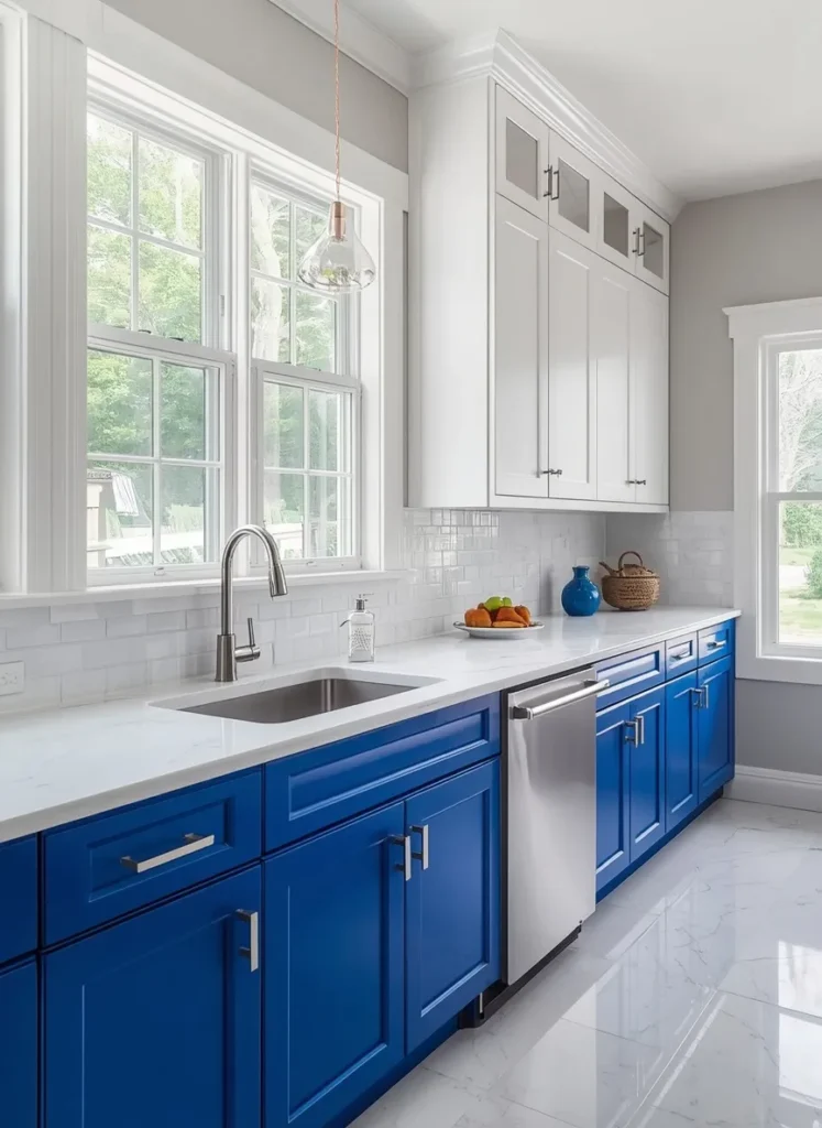
Cobalt Blue Statement
● Creates a bold, energetic focal point in the kitchen
● Works best in bright spaces with plenty of natural light
● Pairs well with white or marble for balance
● Adds personality for those wanting a confident color choice
● Feels fun and modern without going overboard
Cobalt blue is for homeowners who want their kitchen to stand out. This bold tone works surprisingly well when balanced with white. It creates energy without feeling chaotic or overwhelming.
I’ve noticed this shade performs best in well-lit kitchens. Natural light keeps the cobalt from feeling too heavy or dark. The room stays bright, playful, and visually exciting.
Chrome or nickel hardware complements the cool undertones nicely. White marble countertops add a calming contrast throughout the space. It’s a striking choice for confident design lovers.
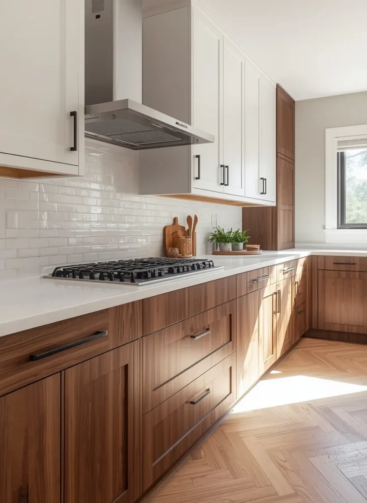
Walnut Wood Pairing
● Adds natural texture and warmth through real wood tones
● Feels organic and grounded compared to painted finishes
● Works beautifully with black or brass hardware accents
● Suits both modern and traditional kitchen styles
● Brings depth and richness without using bold color
Walnut wood cabinets bring warmth that paint alone can’t replicate. This natural material feels grounded, textured, and quietly luxurious. It suits kitchens wanting richness without bold color.
That’s why many designers recommend mixing wood with white uppers. The contrast highlights the wood grain beautifully throughout the day. Natural light makes the walnut tones feel even richer.
Black hardware adds a sharp, modern edge to this pairing. Quartz countertops keep the look clean and balanced overall. It’s a combination that feels both natural and sophisticated.
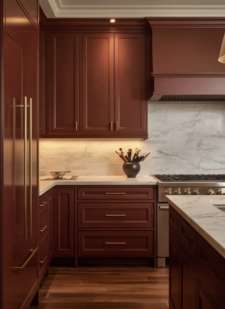
Burgundy Depth
● Brings a rich, romantic depth to traditional kitchens
● Pairs beautifully with gold or brass finishes
● Feels sophisticated without appearing overly formal
● Works well in dining-adjacent or open kitchen layouts
● Adds warmth during evening and low-light settings
Burgundy is an unexpected but striking choice for kitchen cabinets. This deep wine tone feels rich without becoming overwhelming visually. It suits homes wanting drama with real elegance.
I’ve seen this work particularly well in evening lighting. Warm bulbs bring out the burgundy’s velvety undertones beautifully. The kitchen feels intimate and inviting after sunset.
Gold hardware and marble countertops soften the boldness nicely. Ivory uppers keep the space from feeling too dark overall. It’s a pairing that feels luxurious and memorable.
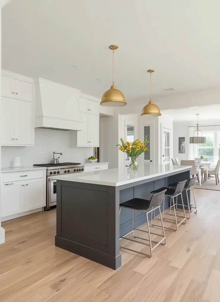
Two-Tone Peninsula Style
● Highlights the peninsula as a natural design centerpiece
● Keeps surrounding cabinetry light and airy overall
● Great for open-concept homes needing visual separation
● Adds contrast without committing to full cabinet color
● Offers flexibility for future kitchen updates
Peninsulas often get overlooked in kitchen color planning. Giving it a contrasting tone changes that completely. This idea creates definition in open-concept living spaces.
In my experience, this works especially well for open floor plans. The color shift subtly separates kitchen and living areas. It keeps both spaces feeling connected yet distinct.
White cabinetry throughout keeps the overall look bright and open. Brass lighting ties the contrasting tones together nicely. This layout remains a strong Pinterest favorite for good reason.
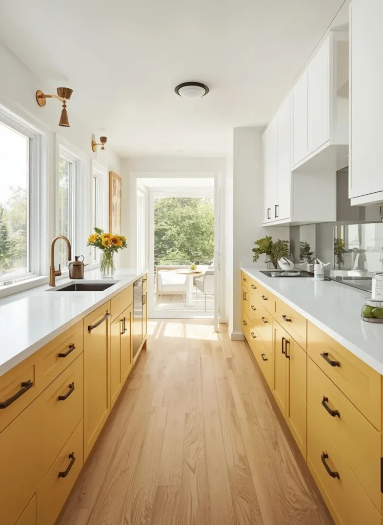
Muted Mustard Touch
● Adds cheerful warmth without feeling overly bright or bold
● Works well in retro-inspired or eclectic kitchen styles
● Pairs beautifully with black or white accents
● Brings personality into otherwise neutral kitchen layouts
● Feels playful while remaining tasteful and balanced
Mustard yellow feels nostalgic yet surprisingly fresh in kitchens today. This muted shade avoids feeling too retro or overpowering. It brings genuine cheerfulness into daily kitchen life.
I’ve tried this pairing in kitchens lacking natural personality. Mustard instantly adds warmth without requiring major renovation work. The transformation feels significant despite minimal changes made.
Black hardware grounds the brightness of this cheerful tone. White cabinetry keeps the overall palette feeling balanced and clean. It’s a combination that photographs joyfully in daylight.
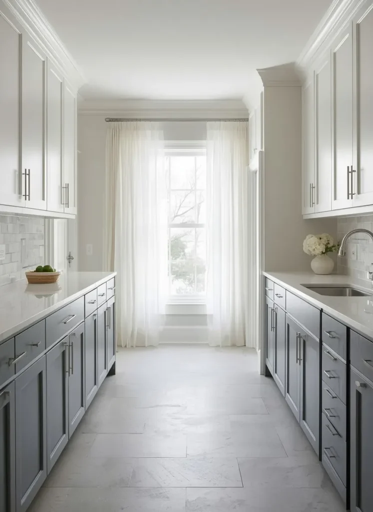
Slate Blue Softness
● Brings a calm, coastal-inspired feel to any kitchen
● Feels soft and soothing rather than bold or dramatic
● Works beautifully in bright, airy kitchen spaces
● Pairs well with nickel, chrome, or silver finishes
● Suits homes wanting subtle color without heavy commitment
Slate blue offers a gentler take on two-tone kitchen cabinets. This muted shade feels calming rather than commanding attention. It suits homes wanting subtle personality over bold statements.
I’ve noticed this tone works beautifully in coastal-style homes. Soft light enhances the blue’s calming, watery undertones nicely. The kitchen feels peaceful and unhurried throughout the day.
Nickel hardware complements the cool tones without competing visually. White quartz countertops keep everything feeling fresh and airy. It’s a soothing choice for calmer kitchen aesthetics.

Espresso Brown Base
● Grounds the kitchen with a rich, warm foundation
● Feels cozy and traditional without appearing outdated
● Pairs beautifully with cream, ivory, or warm white tones
● Hides everyday wear better than lighter cabinet finishes
● Suits classic and transitional kitchen styles equally well
Espresso brown feels like a warm hug for kitchen spaces. This deep tone grounds the room without making it feel small. It suits homes wanting cozy over stark modern looks.
From my perspective, espresso pairs best with warm cream tones above. The contrast feels inviting rather than heavy or dated. Brass hardware adds just enough shine throughout.
Granite countertops bring subtle texture to this warm pairing. Golden lighting enhances the espresso’s rich undertones beautifully. It’s a combination built for cozy family kitchens.
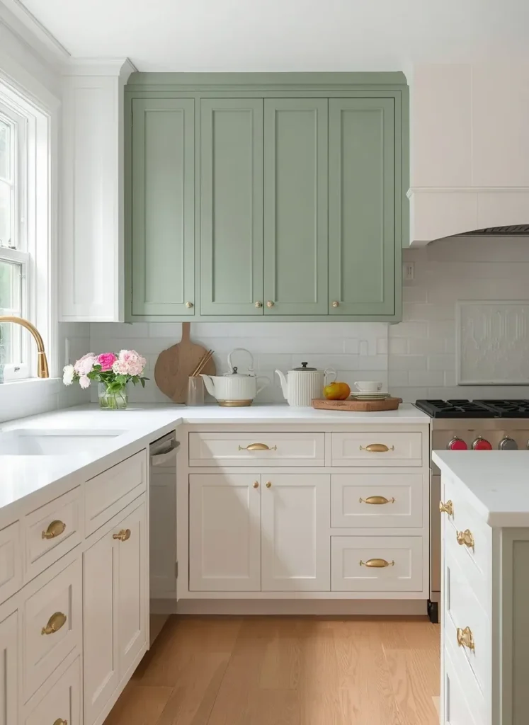
Two-Tone Upper Cabinet Twist
● Flips the usual color placement for a fresh visual twist
● Draws the eye upward, making ceilings feel taller
● Works well in kitchens with limited natural light
● Offers a unique take on standard two-tone layouts
● Adds personality while keeping counters and floors neutral
Most two-tone kitchens keep color on the bottom cabinets. Flipping this order creates a genuinely fresh visual approach. It’s an idea that instantly stands out on Pinterest.
I’ve seen this work wonderfully in kitchens with lower ceilings. Color up top actually draws the eye upward naturally. The room feels taller and more dynamic overall.
White lower cabinets keep the base feeling light and grounded. Brass accents tie the two tones together seamlessly. This twist offers a memorable spin on tradition.

Two-Tone Pantry Cabinets
● Turns a functional pantry into a striking design feature
● Adds contrast without overwhelming the main kitchen space
● Works well for kitchens wanting subtle color zoning
● Great option for smaller kitchens needing visual interest
● Keeps everyday cooking areas neutral and easy to maintain
Pantry cabinets often get ignored in kitchen color decisions. Giving them a bold contrasting tone changes the whole room. This idea adds interest without touching the main cabinetry.
I’ve noticed this works especially well in smaller kitchens. It creates visual zoning without requiring extra square footage. The pantry becomes a subtle but memorable focal point.
White cabinetry throughout keeps daily cooking areas feeling clean. Brass hardware ties the contrasting pantry tone together nicely. This detail adds charm without overwhelming the space.

Warm Taupe Balance
● Offers a warm neutral alternative to classic grey pairings
● Feels elegant and understated rather than plain
● Works beautifully with gold, brass, or warm wood tones
● Suits buyers wanting timeless resale-friendly color choices
● Balances warmth and sophistication in equal measure
Taupe often gets overlooked in favor of grey or white. This warm neutral brings subtle richness without demanding attention. It suits homeowners wanting elegance without bold commitment.
Based on what I’ve seen, taupe photographs beautifully in natural light. The tone shifts gently between beige and grey throughout the day. This versatility makes it a smart long-term choice.
Gold hardware elevates the understated warmth of this pairing. Travertine countertops add texture and quiet sophistication throughout. It’s a combination built for timeless, resale-friendly appeal.

Two-Tone Open Shelving Mix
● Combines two-tone color with functional open storage
● Creates a curated, styled look for displaying dishware
● Adds warmth through visible wood shelving material
● Works beautifully in farmhouse and coastal kitchen styles
● Offers a lighter, airier feel than full upper cabinets
Replacing upper cabinets with shelving changes a kitchen’s entire feel. This idea pairs naturally with bold lower cabinet colors. It creates an open, curated look many homeowners love.
I’ve tried recommending this to clients wanting a lighter kitchen. Open shelving keeps the upper portion feeling airy and bright. Navy or dark lower cabinets ground the space nicely.
Wood shelving adds warmth that closed cabinets simply can’t match. Brass brackets tie the hardware finishes together seamlessly. This combination feels personal, curated, and genuinely inviting.

Deep Teal Sophistication
● Brings jewel-toned sophistication into everyday kitchen spaces
● Pairs beautifully with brass, gold, or marble accents
● Feels bold yet balanced when paired with white tones
● Suits both modern and transitional kitchen designs
● Adds depth without making the space feel closed in
Teal sits between blue and green for a reason. This deep tone feels bold without becoming overwhelming visually. It suits kitchens wanting personality with real sophistication.
I’ve seen this work beautifully with polished brass fixtures. The warm metal lifts the cool teal instantly. Together they create a genuinely upscale, curated feeling.
Marble countertops add movement against the deep teal base. Warm lighting keeps the overall mood inviting, not moody. It’s a bold pairing that still feels livable daily.
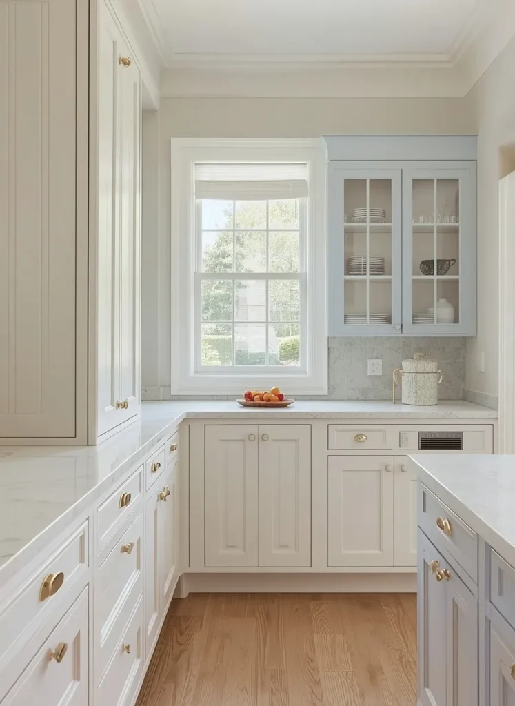
Two-Tone Corner Cabinet Detail
● Turns an awkward corner into a charming design detail
● Adds subtle color without repainting the whole kitchen
● Works well for budget-friendly partial kitchen updates
● Great for highlighting curved or unique cabinet shapes
● Keeps the rest of the kitchen clean and neutral
Corner cabinets are often the hardest space to style well. Adding contrast color here solves two problems at once. It hides awkward angles while adding genuine visual charm.
In my experience, this detail works wonders in cottage-style kitchens. A soft accent color turns a weak spot into a feature. Guests often notice this small detail first.
White cabinetry throughout keeps the main kitchen feeling bright. Brass hardware unifies the contrasting corner nicely. This small update delivers a surprisingly big visual result.

Classic Black and White
● Delivers a timeless look that never feels outdated
● Creates strong, graphic contrast that suits any home style
● Works beautifully with marble, chrome, or gold accents
● Suits both traditional and contemporary kitchen designs
● Offers one of the most resale-friendly color pairings available
Black and white remains the ultimate two-tone kitchen cabinet combination. This classic pairing never truly goes out of fashion. It suits nearly every architectural style imaginable.
I’ve noticed this combination photographs well in any lighting. The strong contrast reads clearly in bright or moody settings. That’s why many designers recommend it for resale value.
Chrome hardware keeps the classic pairing feeling fresh today. Marble countertops add softness against the graphic contrast. It’s a timeless choice that never loses its appeal.
Final Thoughts
Choosing the right two tone kitchen cabinet combination can completely change how your kitchen feels every single day. From bold jewel tones to soft neutrals, these 24 ideas prove there’s a pairing for every home and every style.
I’ve seen how small changes like these can genuinely transform a space, sometimes more than a full renovation ever could. You don’t need to overhaul everything at once. Start with one idea that speaks to you.
Save this post to your Pinterest board for later inspiration. Try a pairing in your own kitchen, and share this guide with anyone dreaming of a fresh, beautiful space.